This article explains how to create a chart displaying data from your Notion account.
To create a chart, you must first link your Notion account to the notion-widgets app. Visit the settings page to connect your account.
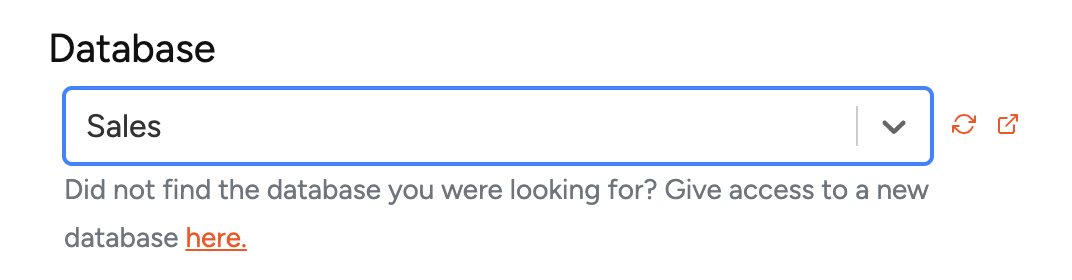
Step 1: Select Your Database
Since charts are based on Notion databases, you must choose which data to display. The selection list shows all available databases.
If you modify database data, click the Sync button next to the database selector to update it. Use the link button to verify you've selected the correct database — it opens the database in a new window.
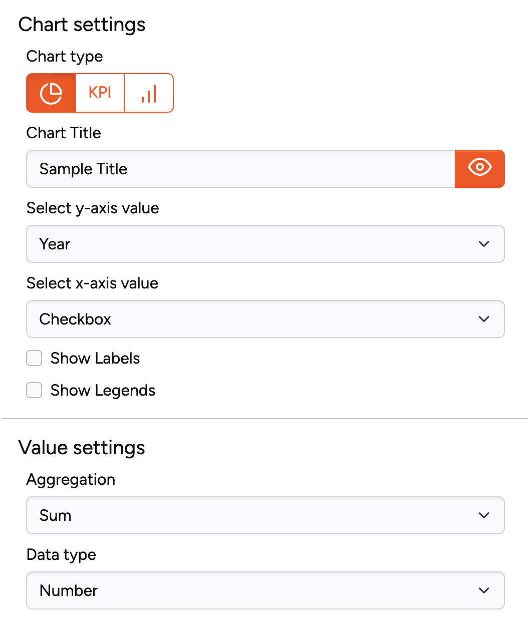
Step 2: Configure Your Chart
Configure your chart by specifying which data displays in which chart type.
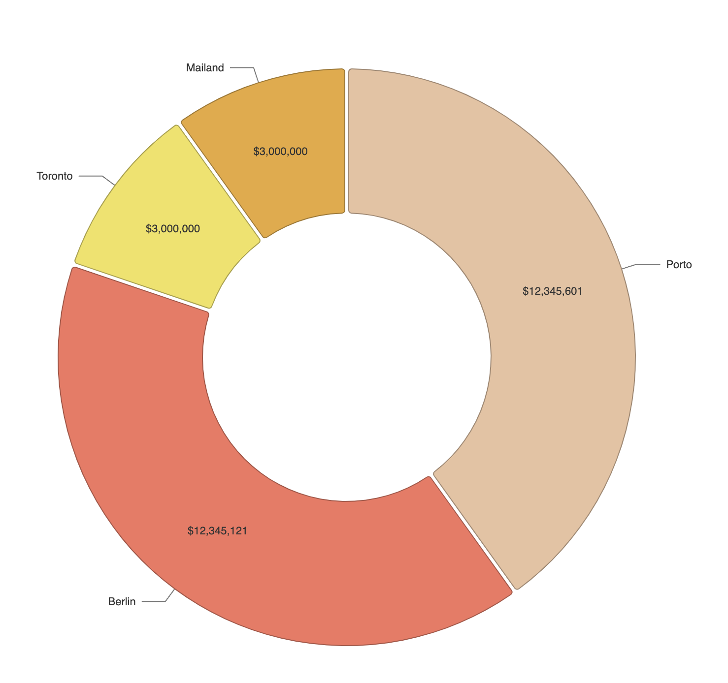
Pie Chart Settings:
| Setting | Description |
|---|---|
| Chart title | Name of the chart |
| Select y-axis value | Numbers to display in the pie chart |
| Select x-axis value | Database column for grouping pie chart data |
| Show labels | Display labels in pie chart (check) or hide them (uncheck) |
| Show legends | Display group names in legend (check) or hide (uncheck) |
Value Settings:
| Setting | Description |
|---|---|
| Aggregation | Method to aggregate y-axis numbers: Sum, Count, or Average |
| Data type | Format options: number, percentage, or US Dollar |
Step 3: Create Widget
After configuring settings to your satisfaction, create your chart widget and add it to Notion.
For charts exceeding 500 database rows, we recommend Data Jumbo — contact support for a 20% discount.